Entries in a legend are populated automatically based on the data. When creating a graph with group classification, the display attributes for each bar are derived from the GraphData1-12 style elements from the active style.
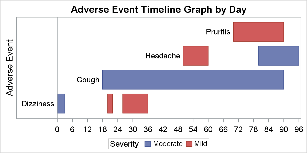 The graph on the right shows you the result of creating an adverse event timeline by AE and Severity. The data contains four AE names with two severity values. The severity values are assigned the display attributes from GraphData1 and GraphData2, which for the HTMLBlue style are blue and red.
Now, if the data for today arrives in a different group order, the assignment may change, so it is hard to ensure that the color assignments are consistent.
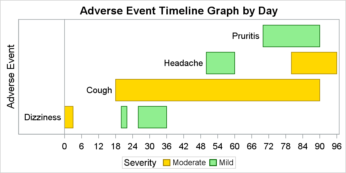 This can be addressed by using the Discrete Attribute Map as shown in the graph on the right. Here we have defined a Discrete Attribute Map where the display attribute for each group value is defined in a data set like a format.
Now, the display attributes such as color or marker symbol for each group are obtained from the attribute map by the value of the group.
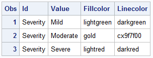 The Discrete Attribute Map is a data set with predefined column names as shown on the right. Multiple maps can be defined in a data set by "ID". Here we have defined only one map, with ID=Severity. Three levels are defined, "Mild", "Moderate" and "Severe". Now, the colors for the each group are well defined, and will remain consistent regardless of the position of the observation in the data.
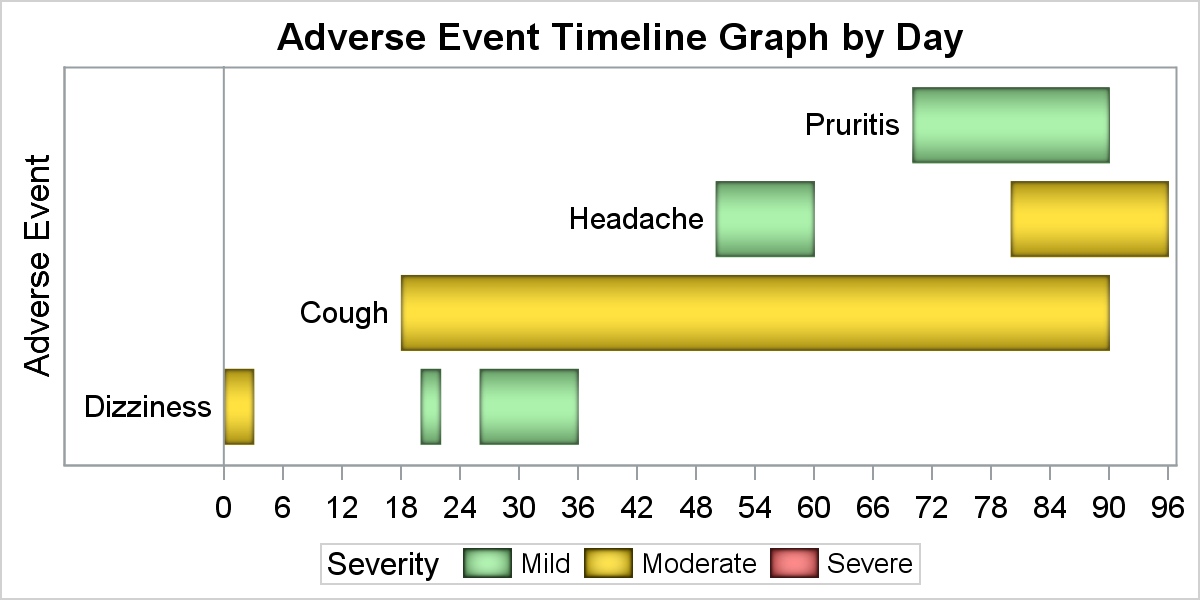
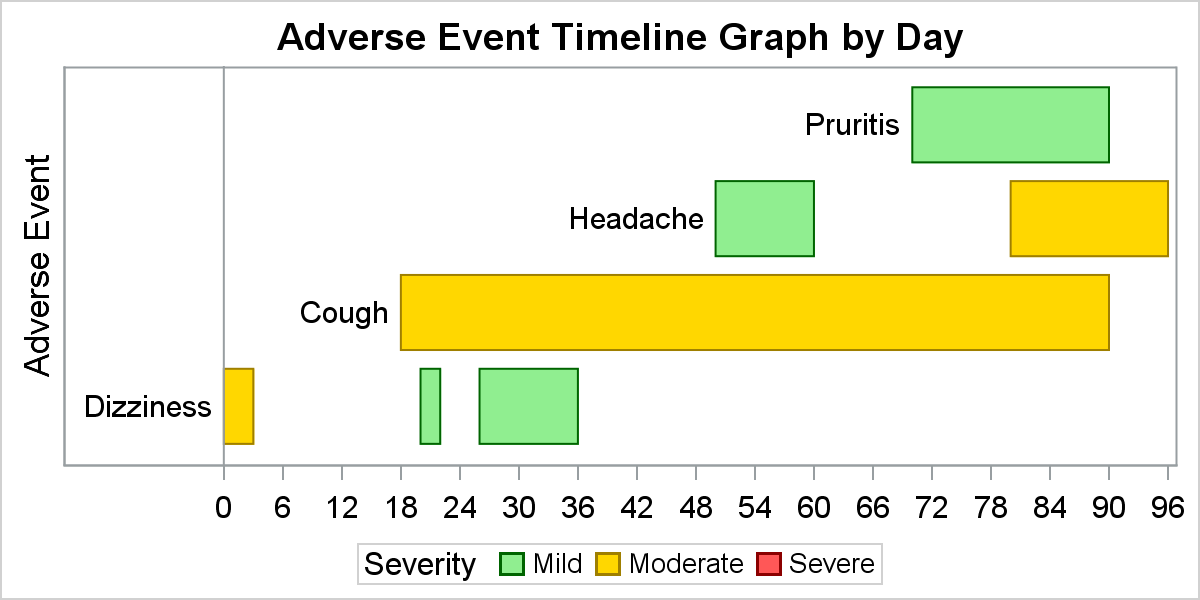 Note however, in the graph above, only two of the three defined values are displayed in the legend. This is normal, and only the values in the data are displayed. However, often we additional classifications for the data that may or may not be in the data at any one time, but we may want to display all the "possible" values for the classification variable in the legend as shown in the graph on the right. In this graph the legend item for "Severe" with a red color swatch is included in the legend, even though there is no observation in the data set with a group value of "Severe"
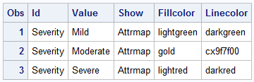 With SAS9.4M3 release, this is easily done by requesting that all the levels for a particular attribute id in a Discrete Attribute Map be shown in the legend. Note the column "Show" with value of "Attrmap". This instructs the system to display all values for this AttrId that are marked as "Attrmap". Note, this is also a great way to populate the legend with other items you may need that are not in the data.
 Another noteworthy feature released with SAS 9.4 is the ability to control the size of the legend items. When skins are in effect, or with fill patterns, or just because you want it so, it is often desirable if the color swatches in the legend could be made bigger. This can be done using the new FILLHEIGHT and FILLASPECT options.
title "Adverse Event Timeline Graph by Day";
proc sgplot data=ae dattrmap=attrmapShowAll;
highlow y=ae low=low high=high / type=bar group=severity
dataskin=pressed barwidth=0.8 lowlabel=label
attrid=Severity labelattrs=(color=black size=9);
refline 0 / axis=x;
xaxis display=(nolabel) values=(0 to 96 by 2);
yaxis display=(noticks novalues);
keylegend / fillheight=12px fillaspect=golden;
run;
Full SAS 9.4 Code: Legend


5 Comments
Pingback: Legend Order - Graphically Speaking
Ah! I've wanted to have this feature! here's a link the SAS 9.4m3 documentation that shows that you can include a variable named SHOW that has the value "ATTRMAP" to get the value to appear in the legend.
Pingback: A simple trick to include (and order!) all categories in SGPLOT legends - The DO Loop
Hello Mr. Matange, thank you so much for sharing the SAS code. I have been using the code as a reference to create the AE Timeline by AEDECOD graph. While stress testing, i realized that the AEDECOD (AENAME) label does not display when a subject has only one adverse event during the study which spans over a few days. The graph simply displays the bar from start day of AE to end day. The AENAME (Used in LOWLABEL) is hidden. Have you experienced any such issue? I would sincerely appreciate your feedback.
Just to add to my question, the issue arises only when the AE is of Moderate or Severe nature. For example, if Subject A has only one adverse event reported from day 4 to day 7 with mild severity, the label is displayed in the graph. However, if subject B has only one adverse event from day 8 to day 16 with moderate severity, then the label is missing.